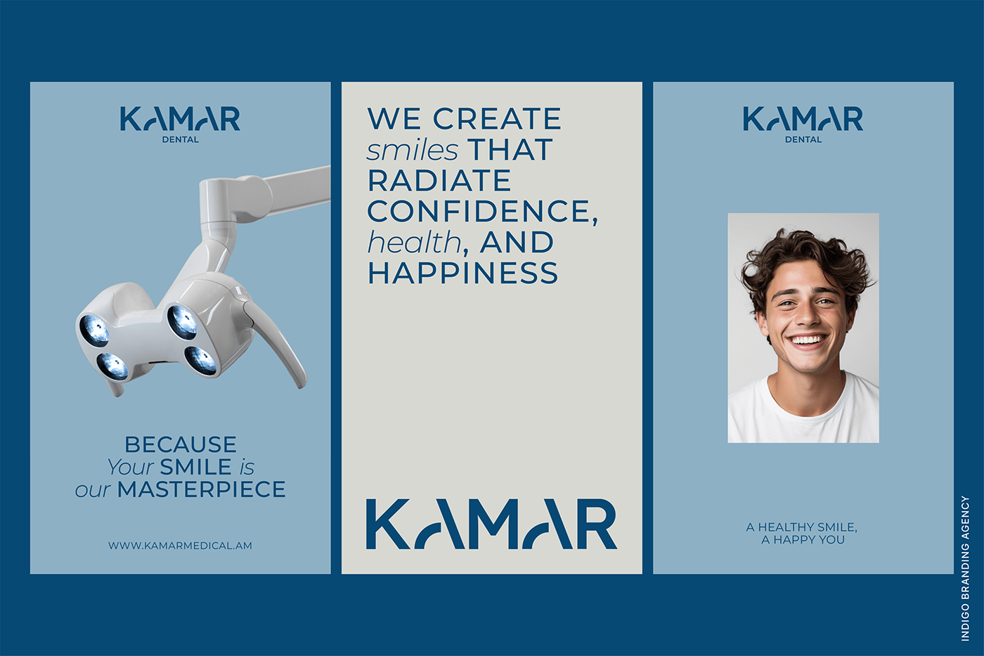


Operating since 1997, “Kamar” dental clinic expanded its services to include aesthetic medicine in 2019.
Our primary objective was to create a logo that aligns with the company's name and conveys a unique meaning.
Our team developed a simple yet expressive logotype – “KAMAR”, designed by hand with arches incorporated into the “A” letters. These arches symbolize the bridge, connecting visitors with specialists.
The center focuses on two main directions: “Kamar-aesthetics” and “Kamar-dental”, which we have distinguished by color schemes. For the esthetic field, we opted for a light pink, complemented by a pastel shade, while for the dental field, we chose dark blue and gray, typical colors in the medical field.
We constructed the entire visual identity using elements shaped like arches, clearly representing the brand.
#kamar_medical #kamarmedicalcenter #indigo #branding #indigobranding #pentaawardsshortlist #indigobrandingagency #packaging #marketing #naming


